Lab 3: Data Visualisation II
Package(s)
Schedule
- 08.00 - 08.45: Recap of Lab 2 and Lecture
- 08.45 - 09.00: Break
- 09.00 - 12.00: Exercises
Learning Materials
Please prepare the following materials
- Book: R4DS2e: “Visualize”, chapters 9, 10 and 11
- Video: William Chase | The Glamour of Graphics | RStudio (2020)
- Web: Patchwork - Getting started
- Web: Scales - Getting started
Unless explicitly stated, do not do the per-chapter exercises in the R4DS2e book
Learning Objectives
A student who has met the objectives of the session will be able to:
- Use more advanced ggplot features
- Customise the data visualisation
- Combine multiple plots into one pane
- Look at a more advanced ggplot and decipher the components used
Exercises
Read the steps of this exercises carefully, while completing them
Assignment Feedback
Everyone who met the deadline for handing in last week’s assignment, should have gotten written feedback - Make sure to read this, so you get feedback on your work and progress!
In the unexpected case, that you met the deadline, but did not receive any feedback, please make sure to contact the teaching team
Introduction
Some authors are kind enough to supply the data they used for their paper, e.g.,
- “Assessment of the influence of intrinsic environmental and geographical factors on the bacterial ecology of pit latrines” (Torondel et al. 2016)
Where the supporting data can be found here:
Getting Started
Again, go to the R for Bio Data Science RStudio Cloud Server session from last time and login and make sure you are working in the r_for_bio_data_science project you created previously, then:
- Create a new Quarto Document for today’s exercises, e.g. lab03_exercises.qmd
- NB! The Quarto document MUST be placed together with your
.Rprojfile (defining, the project root - look in yourFilestab) and also there, thedata-folder should be placed! - REMEMBER paths are important! Also, R is case-sensitive, i.e. “data” is not the same as “Data”
The here package as your friendly neighborhood path helper
Paths can be tricky and as you have seen, some file formats cough .qmd’s cough, may not really feel that strongly about your project setup, so… The here package to the rescue.
If you decided to put your qmd-file in e.g. an exercises-directory, which is a very nice and perfectly understandable idea, then you will find that the following chunk will not work:
library("tidyverse")
load(file = "data/gravier.RData") # Nope!
So here is the trick, here keeps track of your project root, as defined by the .Rproj-file. So the following will work even if you have your .qmd-files in other directories:
library("here")
load(file = here("data/gravier.RData")) # Yup!
Enjoy your friendly neighborhood path helper!
Getting the data
Add a new code chunk and add the following code (Never mind the details, we will get back to this), remember you can use headers to nicely section your quarto Document.
base_url <- "http://userweb.eng.gla.ac.uk/umer.ijaz/bioinformatics/ecological/"
raw_data_path <- "data/_raw/"

SPE <- read_csv(file = str_c(base_url, "SPE_pitlatrine.csv"))
write_csv(x = SPE,
          file = str_c(raw_data_path, "SPE_pitlatrine.csv"))

ENV <- read_csv(file = str_c(base_url, "ENV_pitlatrine.csv"))
write_csv(x = ENV,
          file = str_c(raw_data_path, "ENV_pitlatrine.csv"))
Add the chunk settings #| echo: true and #| eval: true, then run the block and change the latter to #| eval: false.
- Discuss in your group, what this means and why we do it
Click here for hint
Where do we retrieve the data from, where do we write it to, and what happens if we run the chunk more than one time?Wrangling the data
- What is data wrangling?
Before we continue with plotting, we want to unify the data, so here again you will run some code, where the details are not important right now.
But… Make sure, that you have run library("tidyverse") somewhere in your Quarto document - Perhaps under an initial header saying “Load Libraries” or similar?
SPE |>
  pivot_longer(cols = -Taxa,
               names_to = "Samples",
               values_to = "OTU_Count")  |>
  full_join(ENV, by = "Samples") |>
  mutate(site = case_when(str_detect(Samples, "^T") ~ "Tanzania",
                          str_detect(Samples, "^V") ~ "Vietnam")) |>
  write_tsv(file = "data/SPE_ENV.tsv")
Change the chunk settings as before
Data Visualisation II
Read the data
SPE_ENV <- read_tsv(file = "data/SPE_ENV.tsv")
SPE_ENV
# A tibble: 4,212 × 15
Taxa Samples OTU_Count pH Temp TS VS VFA CODt CODs perCODsbyt
<chr> <chr> <dbl> <dbl> <dbl> <dbl> <dbl> <dbl> <dbl> <dbl> <dbl>
1 Acido… T_2_1 0 7.82 25.1 14.5 71.3 71 874 311 36
2 Acido… T_2_10 0 9.08 24.2 37.8 31.5 2 102 9 9
3 Acido… T_2_12 0 8.84 25.1 71.1 5.94 1 35 4 10
4 Acido… T_2_2 0 6.49 29.6 13.9 64.9 3.7 389 180 46
5 Acido… T_2_3 0 6.46 27.9 29.4 26.8 27.5 161 35 22
6 Acido… T_2_6 0 7.69 28.7 65.5 7.03 1.5 57 3 6
7 Acido… T_2_7 0 7.48 29.8 36.0 34.1 1.1 107 9 8
8 Acido… T_2_9 0 7.6 25 46.9 19.6 1.1 62 8 13
9 Acido… T_3_2 0 7.55 28.8 12.6 51.8 30.9 384 57 15
10 Acido… T_3_3 0 7.68 28.9 14.6 48.1 24.2 372 57 15
# ℹ 4,202 more rows
# ℹ 4 more variables: NH4 <dbl>, Prot <dbl>, Carbo <dbl>, site <chr>IMPORTANT INSTRUCTIONS - READ!
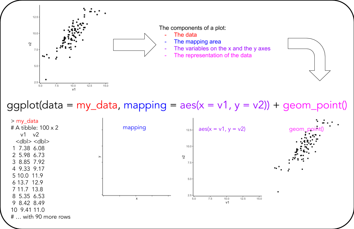
For these exercises, you will have to identify what you see in the plot!
For each plot, complete the following steps
- Look at this overview of the components of a ggplot (see below)
- Look at the plot you are to recreate and discuss in the group:
- What is the data? Take a look at it and understand what is in the data
- What are the mappings? I.e. what variables are on the x-/y-axis?
- Are there any colour-/fill-mappings?
- What are the geoms used?
- Are there any modifications to theme?
Click here for hint
- Consult the Data visualization with ggplot2 cheatsheet
- Check which options you have available
- Consult the chapters in the book you read, see preparation materials for labs 2 and 3
TASKS
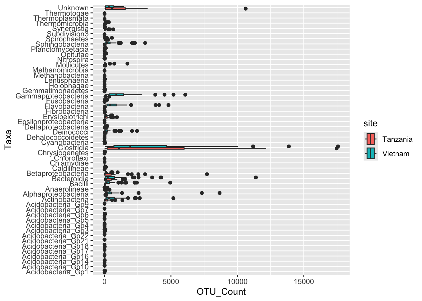
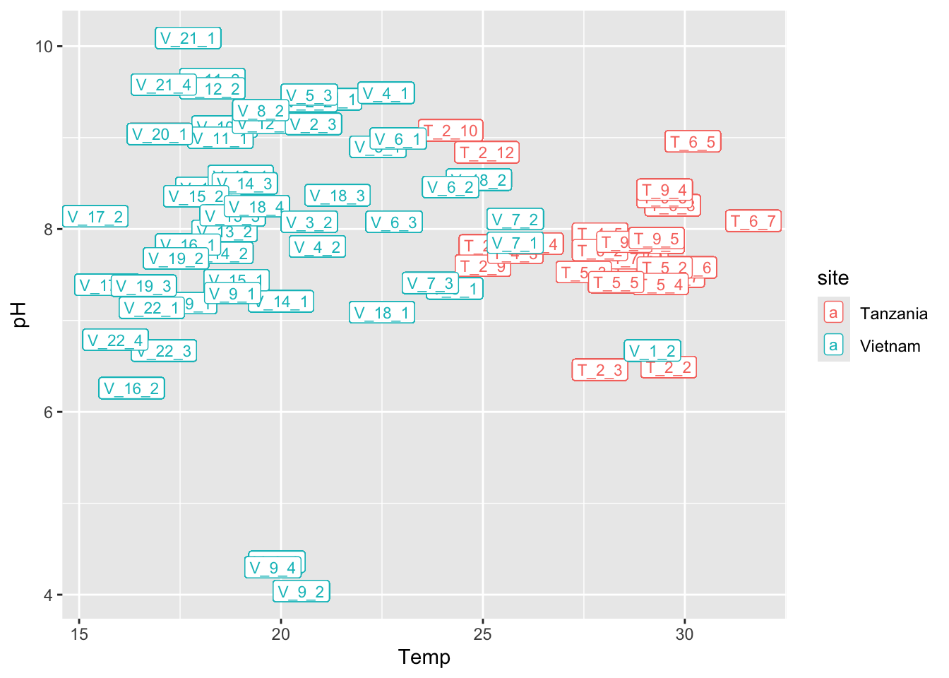
Task 1 - Recreate the following plot
Discuss in your group, which ggplot elements can you identify?
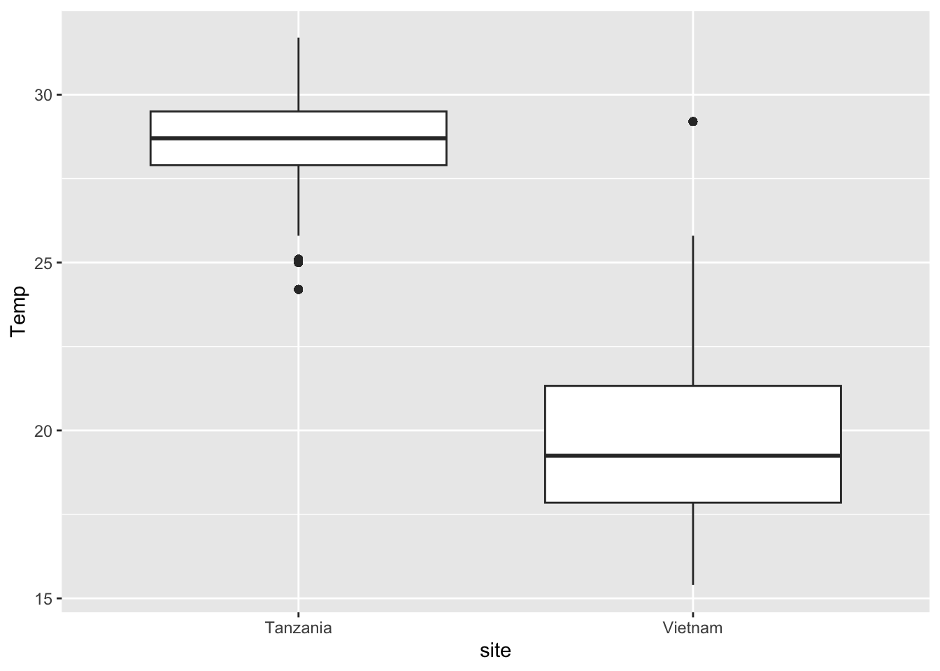
Task 2 - Recreate the following plot
Discuss in your group, which ggplot elements can you identify?
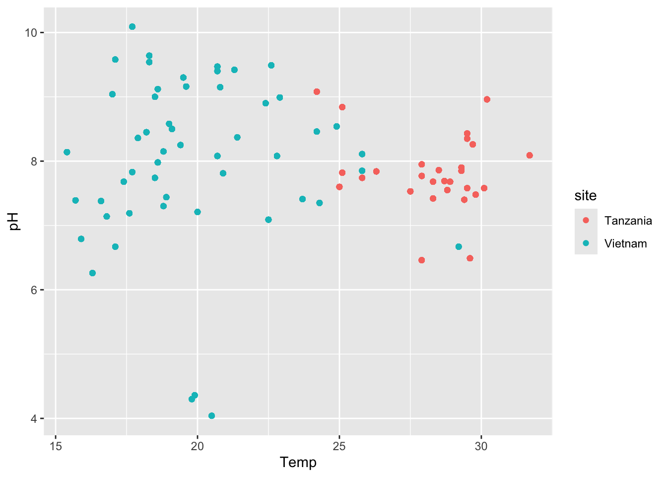
Task 3 - Recreate the following plot
Discuss in your group, which ggplot elements can you identify?
Task 4 - Recreate the following plot
Discuss in your group, which ggplot elements can you identify?
Task 5 - Recreate the following plots
Discuss in your group, which ggplot elements can you identify?
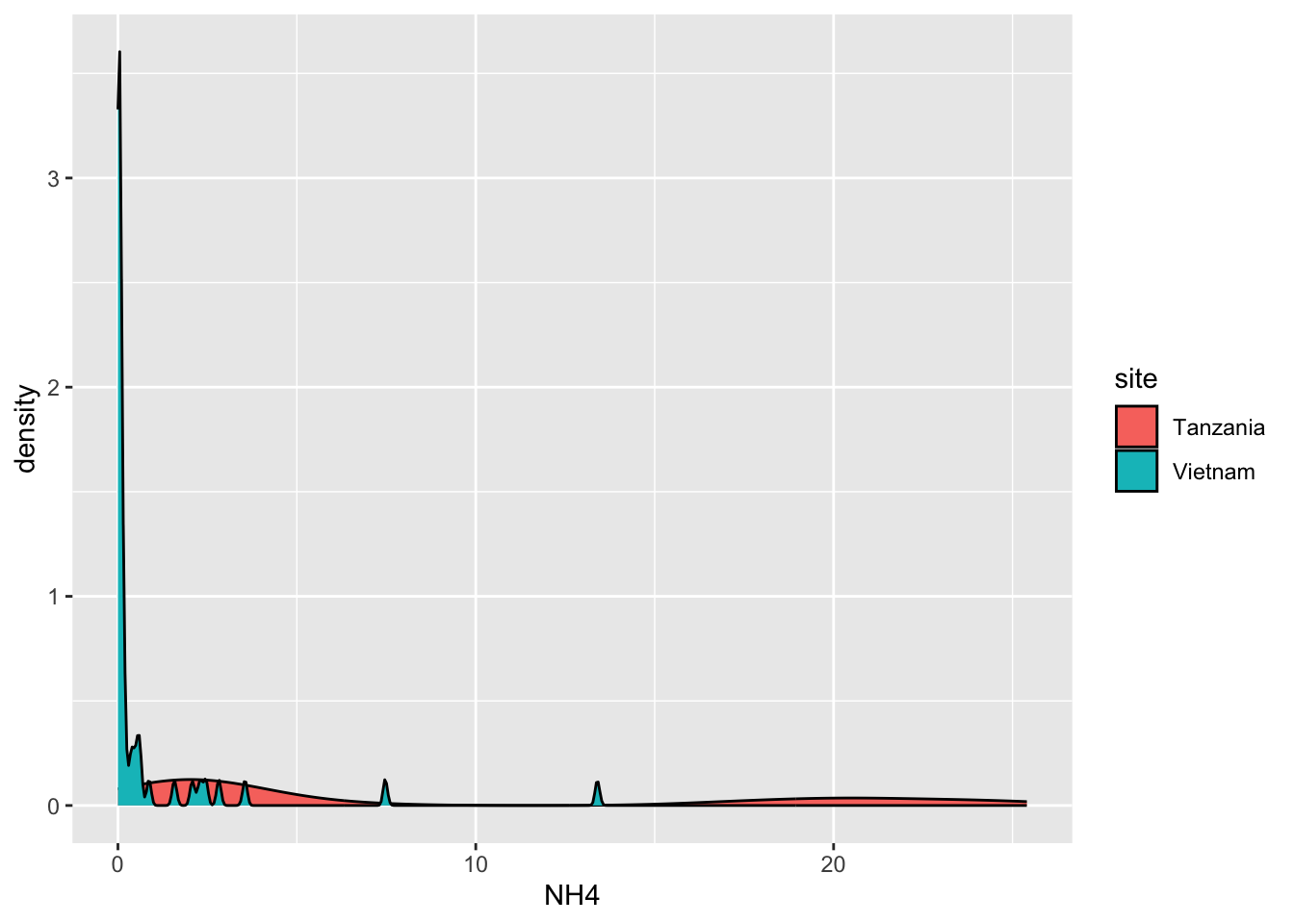
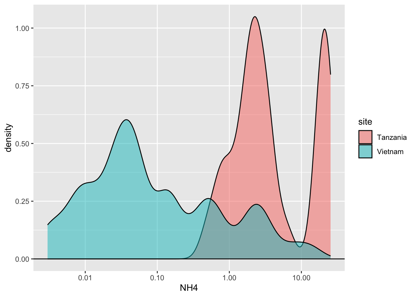
Click here for hint
Same data, but a transformation happened, changing the representation of the data. Look carefully at the axes.Task 6 - Recreate the following plot
Discuss in your group, which ggplot elements can you identify?
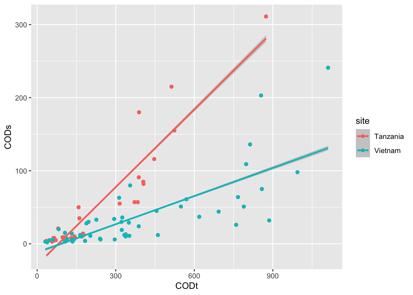
Click here for hint
See if you can find something online ongeom_smooth()
Task 7 - Recreate the following plot
Discuss in your group, which ggplot elements can you identify?
Click here for hint
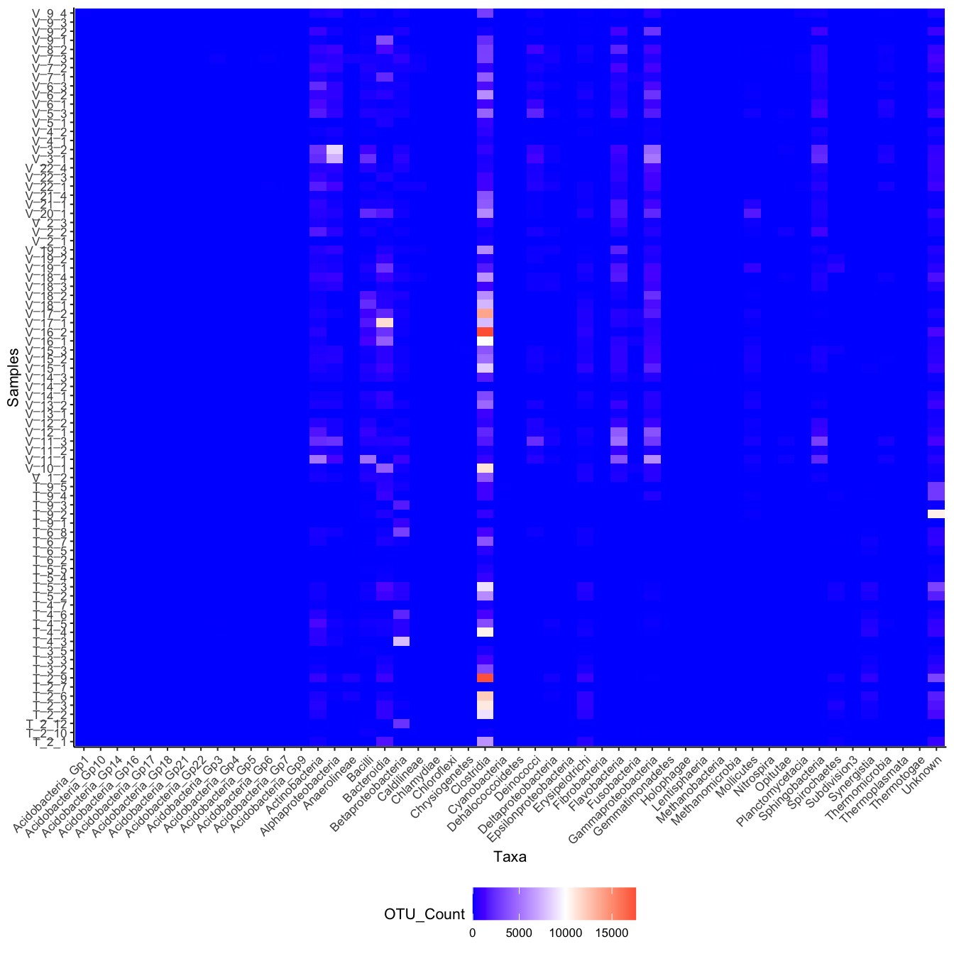
Think aboutfill and then see if you can find something online on geom_tile(), scale_fill_gradient2 and how to ggplot rotate axis labels
Task 8 - Recreate the following plot
Start by running this code in a new chunk (ignore details for now)
targets <- c("Methanobacteria", "Clostridia", "Actinobacteria",
            "Sphingobacteria", "Anaerolineae")
SPE_ENV_targets <- SPE_ENV |>
  filter(Taxa %in% targets)
and then use the created dataset SPE_ENV_targets to recreate this plot:
Discuss in your group, which ggplot elements can you identify?
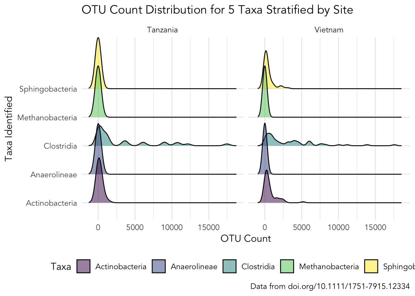
Click here for hint
Here we need to usegeom_density_ridges(), but which package contains this? Also, we are using a colour scale called viridis, but how do we add this? Also, perhaps there are more themes we can use than just theme_classic()?
Task 9 - GROUP ASSIGNMENT (Important, see: how to)
For this assignment you and your group are to apply what you have learned in the two data visualisation labs. The task is to be creative and make a really nice plot using the SPE- and ENV-data sets or a relevant subset hereof, remember to include how you arrive at subsets of the data in your assignment
Try to play around with some custom colouring. There is a nice tool to aid in choosing colours for visualisations here